Before you say anything about your business — before a customer reads your headline, hears your pitch, or uses your product — your logo has already communicated something. It's either working for you or against you, and most business owners have no idea which.
Why Logos Matter More Than People Think
Humans form first impressions in milliseconds. Visual information is processed faster than any other kind. Your logo — the first thing most people see — is doing immediate, silent work: establishing credibility, signaling quality, suggesting your category and personality, and either building or breaking trust before a single word is read.
A DIY logo, an outdated logo, or a poorly designed logo doesn't just look bad. It actively costs you customers who judge your business's quality by the quality of its visual identity — which is most customers, most of the time.
What Color Communicates
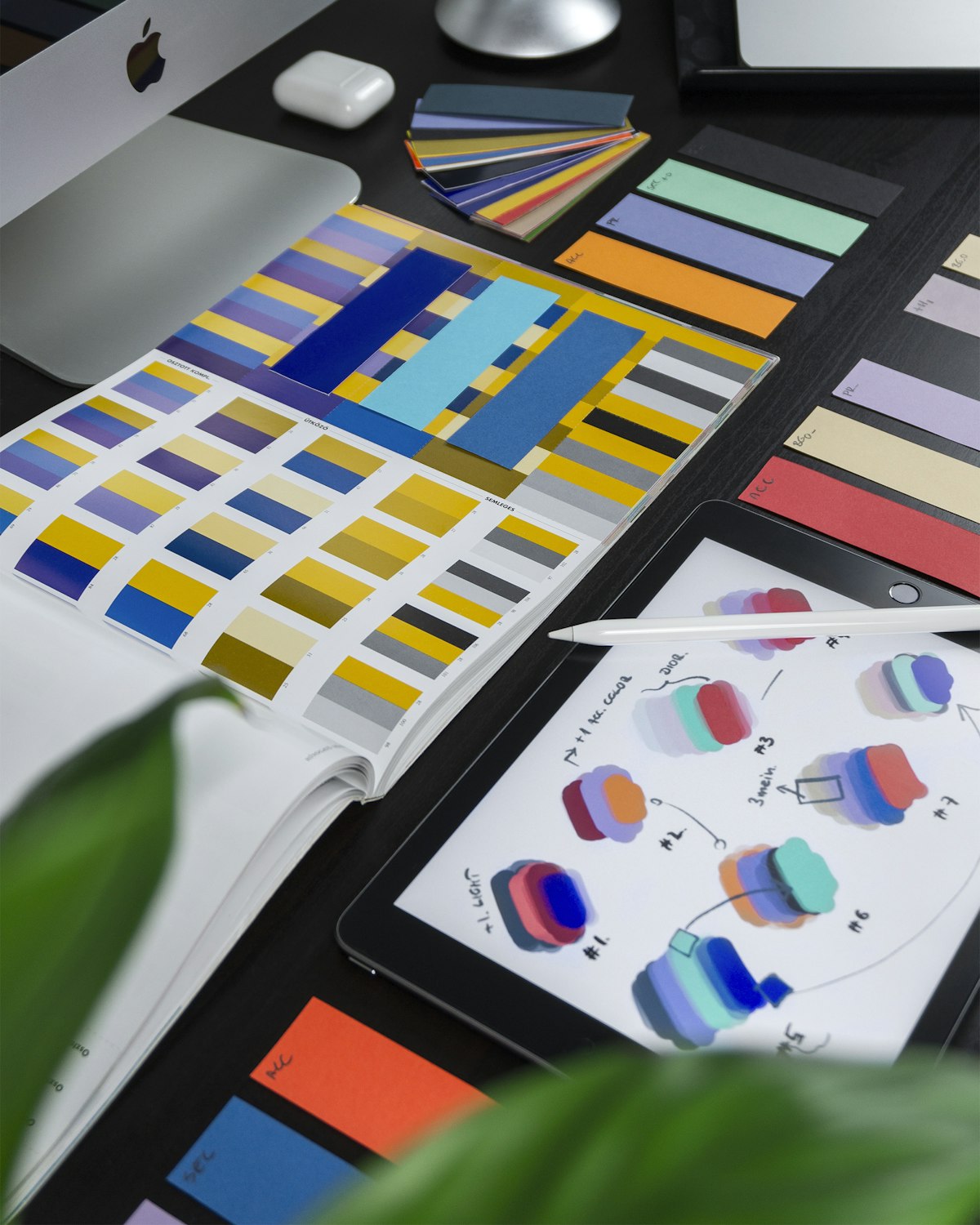
Color is the most emotionally powerful element of logo design. Some consistent associations backed by research:
- Blue — trust, stability, professionalism. Dominant in finance, healthcare, technology, and insurance. The most commonly used color among Fortune 500 brands.
- Green — growth, nature, health, sustainability. Medical, environmental, organic food, financial ("growing your money").
- Red — urgency, energy, appetite, passion. Restaurants, sales and promotions, automotive, entertainment.
- Orange — friendliness, creativity, affordability. Home improvement, children's brands, fitness, casual services.
- Black — luxury, sophistication, authority. Premium fashion, high-end hospitality, luxury services.
- Purple — royalty, creativity, wisdom. Beauty, luxury, arts, spiritual or wellness businesses.
- Yellow — optimism, clarity, warmth. Food, tourism, children's, creative businesses.
This doesn't mean your logo must follow these conventions — breaking them intentionally can differentiate you. But breaking them accidentally (a healthcare logo in aggressive red, a children's service brand in cold gray) creates dissonance that erodes trust.
What Typography Says
The typeface in your logo communicates personality and positioning before the words themselves are read:
- Serif fonts (Times New Roman style, Georgia, Garamond) — established, authoritative, traditional. Law firms, newspapers, universities, luxury brands.
- Sans-serif fonts (clean, no serifs — Helvetica, Futura, Gill Sans) — modern, clean, approachable. Tech companies, design-forward businesses, contemporary brands.
- Script/handwriting fonts — personal, artisan, creative. Bakeries, wedding services, boutiques, personal brands.
- Display/decorative fonts — distinctive, specific personality varies widely. Needs careful judgment to avoid looking amateurish.
A common mistake: using a font because it looks interesting to you, without considering what personality it communicates to your customers.
What Shape Communicates
Even the geometry of a logo mark sends signals:
- Circles and curves — community, unity, movement, softness. Approachable and friendly.
- Squares and rectangles — stability, reliability, strength. Professional and grounded.
- Triangles — direction, dynamic energy, progression, tension. Technology, sports, innovation.
- Organic and irregular shapes — natural, creative, handcrafted. Artisan and environmental brands.
The Most Common Logo Mistakes
Too complex. A logo that looks great at large size may become unreadable at business card scale or as a social media icon. Good logos work at all sizes — which typically means simplicity.
Following trends too closely. The design trend of the year becomes the dated logo of five years from now. Logos should be built to last a decade, not to look current in 2026.
DIY when your business has outgrown it. A Canva logo for an early-stage business is fine. A Canva logo for a business generating $1M+ per year is sending the wrong signal to every prospect who encounters it.
Choosing what you personally like over what serves the brand. The logo isn't for you — it's for your customers. The question isn't "do I like this?" but "does this communicate the right things to the people I'm trying to reach?"
What Good Logo Design Actually Involves
A professionally designed logo isn't just aesthetic work — it's strategic work. A good designer asks:
- Who are your target customers, and what signals build trust with them?
- Who are your main competitors, and how should your logo differentiate?
- Where will this logo appear — digital, print, signage, embroidery, vehicle wraps?
- What's the long-term direction of this brand?
The answers to those questions drive every design decision. Logo design without that strategic foundation produces something that might look fine but doesn't serve the business's actual goals.